🧙‍♂️ My Role

Senior product designer UX/UI (solo designer)

🕵️‍♂️ Problem statement

  • Travel agents share a single agency login to use Qantas Agency services, this is a security issue. (e.g one agent can change another agent’s work)
  • Qantas cannot identify individual user who actually made the change to a flight booking, this is also a security risk.
  • Agency’s with multiple IATA numbers need to logout of an IATA number and login with another IATA number to make changes to customers flight bookings.

✅ Impact

For Travel Agencies (Users)

  • Streamlined Access: Over 30,000 global travel consultants can now use one easy login to access all Qantas agency services, switching multiple IATA numbers eliminating constant sign-in/sign-out friction.

  • Enhanced Security & Control: Agency owners can onboard/offboard consultants instantly, reducing unauthorized access risks when staff change.

  • Accountability: Each consultant’s actions are traceable, minimizing disputes over booking errors.

For Qantas (Business)

  • Operational Efficiency: Reduced support tickets for login/IATA-switching issues, password changes etc.

  • Improved Compliance: Audit trails for every booking change mitigate fraud and compliance risks.

  • Service Adoption: Unified access increases engagement with Qantas’ agency tools, driving revenue.

🙎‍♂️ Users

  • Travel agency consultants
  • Travel agency managers
  • Travel agency owners / administrators
  • Qantas agency operations team

📐Design process

Create design plan base on high level business and architectural requirement. The design plan outlines the design activities to be done:

1. Scope & Foundation

  • Define design objectives based on business needs and architectural constraints
  • Audit existing research and system mappings (user roles, IATA relationships, site structures)
  • Establish site IA and navigation framework

2. User Flow

  • Draft high-level user flows for core capabilities in Miro
  • Conduct iterative reviews with Internal core teams, design team and external stakeholders

3. Design UI interaction

  • Translate validated flows into Figma prototypes using Qantas design system
  • Refine the design through stakeholder feedback loop

4. Validation Cycle

  • Remote user testing (Askable/MS Teams) with Figma prototypes
  • Analyze results update design as needed to be retested again.

Design plan

Qantas GatewayDesign plan
Qantas Gateway Design plan

High-level site hierarchy

The user “Account Center” is a new portal that needs to be created to house all user actions. I create a high-level information hierarchy that establish logical relationships between user accounts and agency accounts, mapping out where each management action occurs. This helps the business get an idea of the scope of what they will be building.

Key features:

  • ✅ Clean, focused design that only includes essential account functions that are shared between all sites
  • ✅ Avoids overlapping features with other Qantas agency systems to prevent confusion
  • ✅ Easy-to-understand agency roles that can translated from the workplace.

We designed it to work like familiar account dashboards (Google/Microsoft) since most agents already know these systems. Testing showed agents could easily switch between this and Qantas’ main booking site.

Qantas gateway site hierarchy

portal hierarchy

Breaking down user tasks

In enterprise projects like this usually begins with technical architecture diagrams and business requirements outlining system integrations. However, these alone will not be enough, you need user flows to bridge and “connect the dots” to answer questions like:

  • Should consultants register their own accounts?
  • Should agency administrators create accounts first?
  • What happens if user registering is not an agency employee?

To move these conversations forward, I create high-level user flows in Miro. These flows, presented twice weekly to internal teams, served as:

  • A discussion tool to align on solutions meeting both business needs and technical constraints
  • A living document that evolved through feedback from architects, business analysts, and project managers

This iterative process transformed abstract debates into focused design decisions, with the user flows becoming our shared reference point for all subsequent work.

Registration user flow evolution

The registration process underwent significant iteration to meet key requirements while optimizing the user experience. The final flow accomplishes the following:

✅ Streamlined Onboarding
Both admins and consultants can register using their agency’s IATA number. User testing revealed that auto-populating agency details from IATA records minimizes user inputs and reduces human errors.

✅ IATA-Based Registration Logic
The system checks whether an admin has already registered the agency with an IATA number. If so, new users are onboarded as consultants; if not, they can initiate admin registration.

✅ Secure, Automated Validation
User email domains authenticate agency affiliation, eliminating manual verification by operations teams.

✅ Adaptive Step-by-Step Flow
To handle multiple registration scenarios (e.g., varying roles, existing/unregistered agencies), the process dynamically adjusts guiding users through only the necessary steps.

Administrator agency registration mock-ups

New administrator registration

Building Figma prototypes

As design feedback on the low-fidelity mockups becomes more defined through iterative review sessions, I refine and translate these elements into Figma. The key objectives include:

  • Keep the flow, decide on layout and responsive mobile versions
  • Adhere to Qantas branding design consistency, and the Qantas B2B design components.
  • Make it a figma prototype so that it be played back to showcase and later to conduct usabiliity study.
  • Use by marketing and copywriter to review the copies
  • Additional design components are created in Figma so those can be updated when new changes come in later. 

Below is the Figma protype version of the Admin user registration.

Key fIgma prototypes

✅ Login flows, multifactor authentification, password reset
✅  Admin/agency and consultant registrations and account activations
✅ User profile changes
✅ Consultant user account approval / decline flows
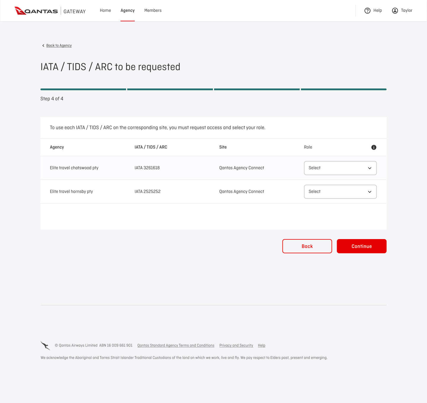
✅ Management of user IATA role, site access permissions
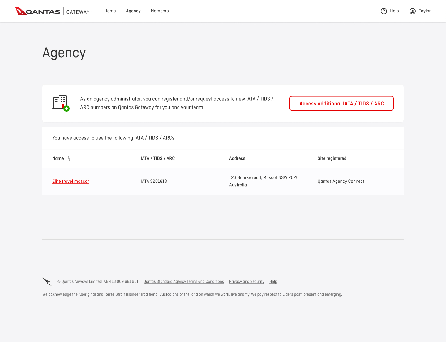
✅ Register additional agency IATAs by Admin
✅ Request additional agency IATAs by consultants

Administrator agency registration UIs

Admin and agency registration

Mobile screens of Admin registration

Conducting Usability Testing 

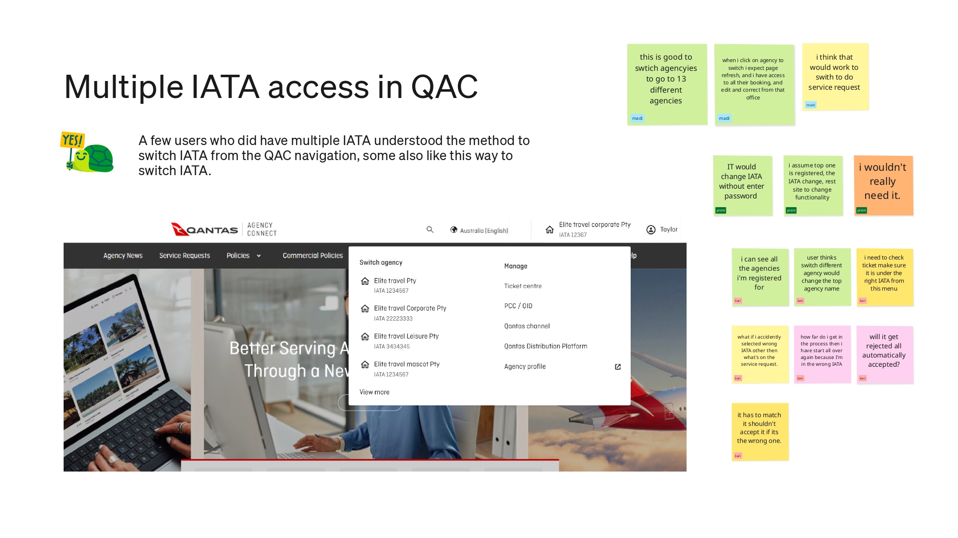
Once the wider teams are happy with the Figma designs, there is a narrow window to test the design with users, as the dev team are push to start building it. I was able to complete 3 rounds of usability study through out the project, each one focusing on a key capability of the user journey.

To gather feedback, I sourced participants from:

  • Askable.com (travel consultants)
  • Internal Qantas account managers (to connect with customer contacts)

Key responsibilities in running my study

  • ✅ Defined goals, user questions, and test tasks. Refined the script in collaboration with the design team
  • ✅ Adapted the Figma prototype to match study tasks. Incorporated nteractive flows and error scenarios for realistic testing
  • ✅ Scheduled and invited participants. Encouraged team members to observe and record sessions
  • ✅ Compiled findings in Miro, using affinity mapping to identify patterns. Presented insights in a structured report, highlighting:
    • Successful design elements
    • Areas for improvement
    • Potential major redesign recommendations

Key Usability Findings

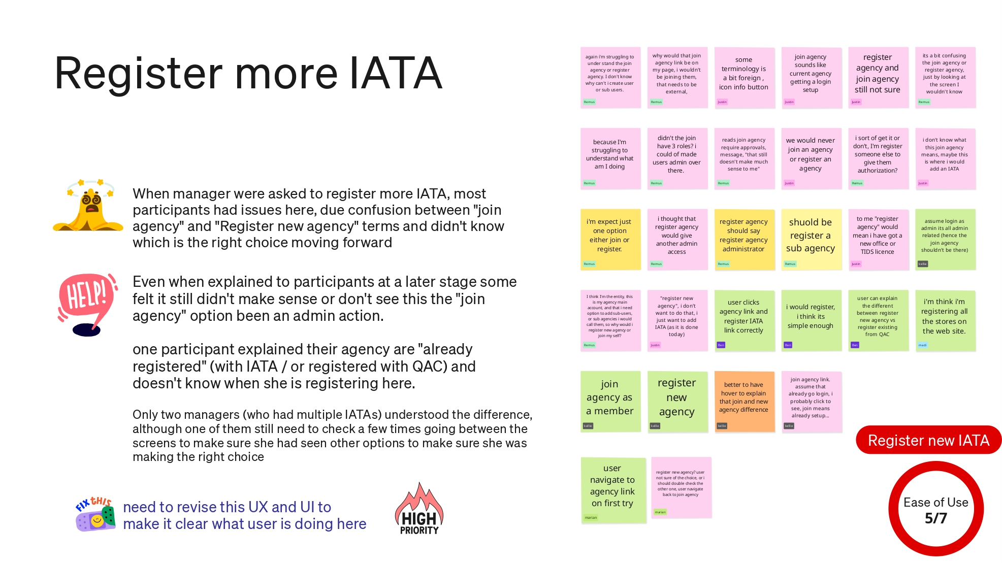
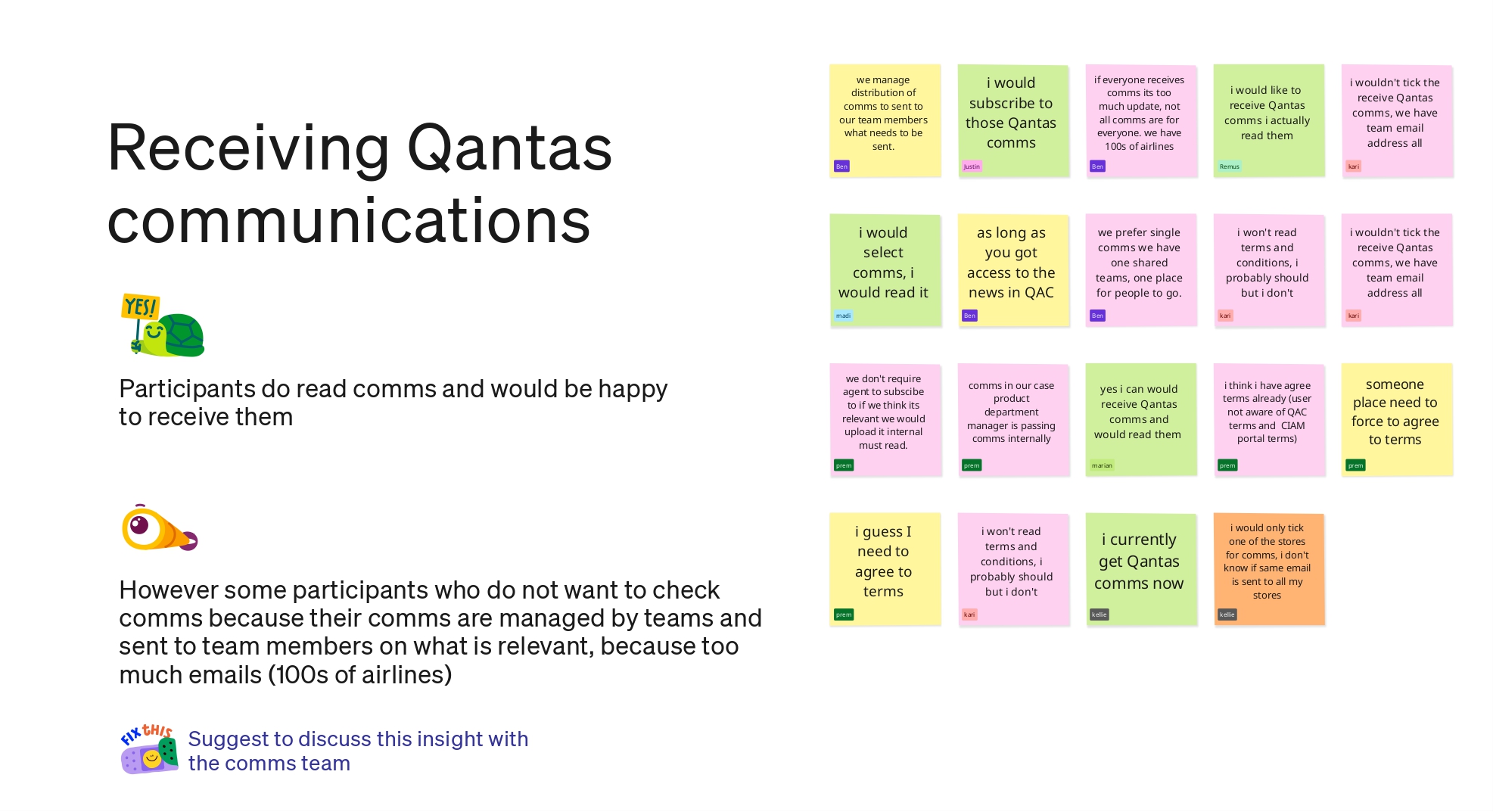
Confusion Between Registration & IATA Number Requests

  • 🚩 Users initially struggled to differentiate between registering an account and requesting an IATA number for flight bookings.
  • 🚩 The solution involved first capturing the IATA number, then dynamically guiding users based on their role (e.g., prompting Admins to register an unlinked IATA before proceeding).

Differing Needs Based on Agency Size

  • 🚩Smaller agencies preferred letting consultants self-register.
  • 🚩Larger agencies (1,000+ users) required centralized user creation without approval delays.
  • 🚩 The system needed to support both workflows.

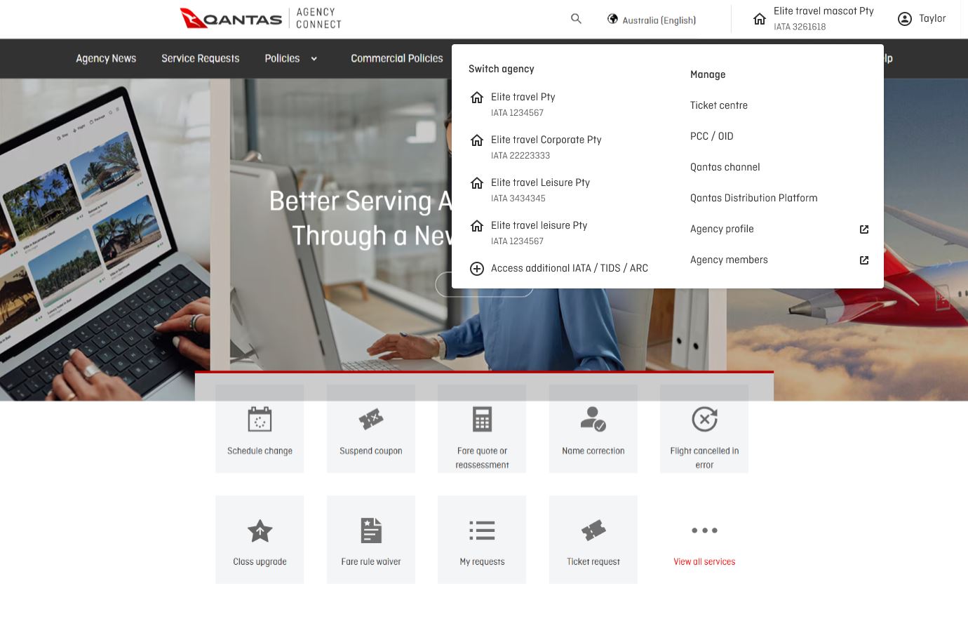
Preferred Access via Qantas Agency Connect

  • 🚩 Most users accessed account features directly through Qantas Agency Connect (their primary flight booking tool).
  • 🚩 Users didn’t need awareness of a shared “Account Center,” critical functions had to be seamlessly integrated into their main workflow.

Results & Reflections

Designing the Qantas Gateway central identity portal end-to-end was a rewarding experience, it was even more meaningful by the fact it was accomplished with a small core team of just four people.

Here are some of the challenges and learning along the way

  • 🌟 Multiple stakeholders, one account vision. 4 different site owners each with their own priorities to sync up with the account center. To manage this I run showcase to demonstrate flow that impacted their existing customer experience. e.g How existing users will migrate across to the new account. I do not show interactions or UI copy, discussion are slow when everyone has an opinion on the UI, those decisions should be left to the designer.
  • 🌟 Usability studies as visibility tools Involving stakeholders early in usability research created visibility and engagement. Hearing direct feedback from real users helped stakeholders think beyond business needs and connect with the human impact of the experience.
  • 🌟 Simplify, simplify, simplify One recurring issue was the complexity created by combining IATA codes, roles, and sites. This mental load for users who had to constantly figure out which identity applied where. Simplifying this model would have not only improved the UX, but also reduced development time and scope.

Written by David Wen Ying 2025